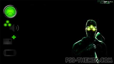
Theme by DemiGod7

Ok, so I went into this theme with the mentality that is prevalent in the game, hiding from enemies and being fast, quiet and efficient. Like Sam when he hides, the icons are “hidden” in the black background, enough to miss the eye fast but you can still see them.
Most icons also carry the trademark colors of Sam’s goggles and detection light. Some of you might not know, but older Splinter Cell games had Sam with a green light on his back. This wouldn’t affect the enemies in any way, it was there so the player knows where Sam is at any given time. So, with that in mind, some of the icons have this effect, they are hidden but can be “seen” by the user. Some icons don’t, I couldn’t find a way to add the effect.
Feedback is always appreciated, whether good or not as long as it is constructive.
Download Here

@OPTIMUS
For some odd reason, Sony decided to move the Trohy icon between other high-res icons (what’s new, PS Home etc.) so I decided to give the trophy icon the same effect so as to not stand out.
People seem to like the Account Management, but I was actually trying to find a high res Account Management icon so that all those icons in a row were high res….before I decided to add the third circle there.
Anways, thanks for the good words and I’m glad you guys like it 😀
@DemiGod7: Absolutely awesome! Just like a S.C. game should be…
In my opinion, the only thing that doesn’t fit well – considering the very good “atmosphere” you gave to the theme – is the trophy icon. But maybe it was intentional, I don’t know…
Anyway, mate, what I know for sure is you did a great job (and very original) and I really like it: +++++++++++++++1! 😀
This is what i’m talkin’ about back in a days when you’re in shadows you were in a shadows.
Thanks for the up!
creative, i like it. unlike the actual game.
i think the developers are making excuses to change the game to appeal to the masses. who knows what lame shit theyll make excuses for next. we’re reducing plot because it “takes up too much time” or “cost too much” or “alienated our audience”. oh boy
this is what it looks like to me.
I hear you Ultra. 🙂
I was not supposed to add a title, I just threw it there above the info for no apparent reason lol.
More backgrounds? Well, you can download and add your own, I just wanted the darkest one out there. 😉
I like this too. lol @-.- the account management icon. Moving the title to the left side would be better. My only real complaint is I want more backgrounds 🙂 +1
Thank you kindly F-Rott!!
A good word from a theme maker such as yourself means a lot for me 🙂
I love it. I love the whole thing. The Icons, the Background, the IDEA.
Love it.
+1 from me, DemiGod7. GREAT job!