Theme by AUDIODEVIANT

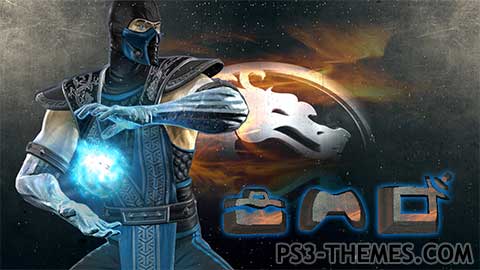
Subzero mortal kombat vs dc universe
Animated frost energy ball , and water drops on the screen .. Enjoy
Download Here
Animated frost energy ball , and water drops on the screen .. Enjoy
Download Here
#1 Resource for PS3 Themes
Theme by AUDIODEVIANT

@faxtron ha ha sweet as … ive got the old massive 2600 but it doesnt work , the controler s are fine but unit just said enough , is enough lol
Me too buddy, the only difference is that i started with Atary 2600 Actually, I have all of them yet. …
@AUDIODEVIANT awesome sub-zero 5/5
@Penningstoned420 it was a joke !
“were all only as young as the woman laying next us” -Wishful thinking. Born in 81 & she’s 19 years old. Legal but not the same age.
Hey there OPT, nice seeing you still coherent & here. Always a good thing, “cheers mate” as you would say
@doom gamer 4 life … same same
except i started with the commadore 64 , then atari …. then the snes , then the sega saturn then all the ps3’s … ,dreamcast xbox , xbox 360 , i still have them all …
im 31 in october.. bin rockin consoles since the dawn of nes.. i will never stop being a gamer,
@EVERYONE: Loool!
@JAYDEE1003: Lucky guy…
Nah. We are out there. Born in the 90s aint bad. Old school gamers are all the same. Who doesn’t like a challenge. 3 lives and 0 save points.
@everyone lol , were all only as young as the woman laying next us …
am i the only one born in the 90s??? lol
Us 70’s babies ain’t old yet
@AUDIODEVIANT: Aaargh! You’re lucky! I’m almost 40, by now…
Holy $hit, mate! That’s GREAT! I’ll be waiting for it!
@ OPTIMUS lol , not old born in the 80’s. but yeah i guess some would say thats old … what do you think of this …http://youtu.be/fkfShQz9b7A
@AUDIODEVIANT: Lol! Same for me: glad to know there are other “oldies” like me…

Yeah! MK1, MK2 (and don’t forget MK3) were great games!
Oops! I almost forgot… there are also other MK themes made by my friends Yogosan and F-Rott: go see them too!
@doom the message bubble is designed that way. only the left and right edges don’t get stretched. I’ve done things with it like putting small logos in the corners in my Lollipop Chainsaw Dynamic Theme. I think Jaydee1003 made it look like cartoon wood panels in his South Park Dynamic Theme too. There are a few things you can do with it.
@Harima i use AE
wow amazing frost effect+1 is that photoshop or maybe its something else anyway thanks for this ^^
@OPTIMUS .. lol me to im a bit grey around the ears lol.. mk 1 mk2 were the ones i grew up with subzero raiden and scorpion, were my favs ..
and i will do that thanks .. PRIME
@AUDIODEVIANT: Looool! You’ve read my mind: Raiden is exactly one of the first characters I was thinking about (as well as Scorpion, Shang Tsung, Sindel and others…)! THANKS!
As for the style of the icons the other friends are suggesting…
Why don’t you take a look to my “Let Mortal Kombat Begin” theme? You maybe could get a new idea for your next MK theme
@doom .. look im new at this my self so, yeah… i have not played with much of any thing yet once i get the hang of it , im sure i will turn to other things in the scene and try to improve them aswell.. i hate spending to much time on theme as it tends to do my head in.. lol
if themes have bin progressively getting better how come the message bubble never gets played with as far as projecting what was originally intended instead of an image that looks like stretched silly puddy… cant there be an improved sized up picture to ‘tone down’ the stretching effect? im not trying to rant about it and i dont intend to come off like i am. im just wondering. it would be crazy awsome if someone fixed that issue one day and you can see what the artist’s original design for the message bubble was at any size…
yeah yin yangs and stuff +1
i liked your other theme aswell but the message bubble in the upper right corner looked too white over the text and i couldn’t see who was sending the message
@ everyone thanks for the kind words …
@Jaydee1003 @uLtRaMa6nEt1c
i do agree but … im still experimenting with my icon making and im having fun with it ,..
i think i will go with the icons reflecting each character. i am not sure as i only came up with the idea , and smashed out a couple of themes , but that also makes so much more work .. oh well im sure what ever i do will be ok .. surely
I agree with ultra.. i think you should either make a set of icons with a mortal kombat style and use it for all of them OR make unique set of icons reflecting the character.. for example if you make a scorpion theme the icons can be on fire..
Very nice. I’m liking the effects you put in your themes. +1
If your doing a set I think the icons should have more of a Mortal Kombat feel to them
awesome theme! and im lovin the raiden one!! yoo do a scorpion, and a “rain” theme. By rain i dont mean like animated raining i mean the character “rain” LOL anyway def a +1 great job keep it up !
Great theme +1 Thanks !
@OPTIMUS thanks champ … oh and that’sthe plan my friend im going to do the hole set.. just uploaded this
http://youtu.be/FGaB_OazEvw
Well done, mate! +1!
I’d like to see other characters…