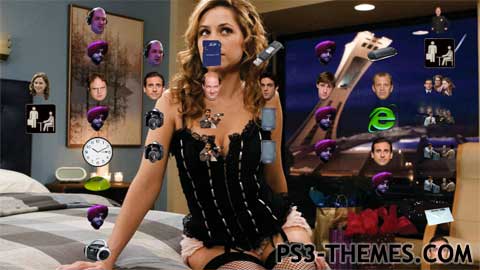
Theme by Krunchu

The office theme…It was really hard (Thats what she said)…I know one of the pictures isn’t from the office but it is of pam and she is hot, so suck it up ( thats what she said ) and I hope you like the way it looks…sorry( Thats what she said ) but seriously thats what she said. ( There are 8 backgrounds and this supports HD and SD )
Download Here
Seinfeld

thanks for the advice, I know it’s stupid but I didn’t really think of it until now, that icons should be understandable to the mass crowd if I’m going to be posting them on websites like this one. Thanks for the tips I’ll definitley use them when making my next theme
I can see the far fetched idea that those people will fit in as icons, but you can’t expect the user to know all that, even though they have seen the office. (I have). It’s a good idea to put them there. but a white frame around a picture of ryan, and you have a picture Icon, a filmstrip og TV around micheal, and you have Film icon, it’s little things like that, that will make your theme stand out from the crowd. Download some of my themes and you will get the picture….or you will just one star them… Read more »
Wow, that looks stupid. Sorry, that last comment was an attempt by my little brother to compliment my theme
bueno
I agree, Krunchu, I can see that alot of the characters you use relate to thier function on the ps3. I am a huge fan of the office, so I am so happy that you created such an accurate theme for them. Job well done! 🙂
Actually you almost made me forget what I did myself the main icons do correlate to their purposes and if you watched the office you would know it. Kevin = music icon; hes in a band ( scrantonicity ) Pam = users icon; she is the office receptionist Dwight = settings icon; he is obssessed with power and control jim = game icon; he invented the office olympics plus he plays tons of other games when he should be working and finally toby = network settings; he works in human resources and is kind of the network of the office.… Read more »
its hard to find “The Office” related Icons for each different main icon that relate to it. The reason I used the sikh computer tech guy a lot was because I didn’t want to just download a bunch of icons, I wanted all the icons to be original and again thats hard when using the office as your theme. But I will try to make one better, thanks for the tips.
I don’t think this theme is very good. The main icons are just the heads of the actors, it doesn’t in any way indicate what it represents. That alone takes it down a few notches. I also see that alot of different icons have the same Icon, that is just lazy, so if you are going to complain about people not rating your hard work fair, then maybe you should work harder (that’s what she said)? A good set of icons takes a few days to make.
this is a good theme I don’t know why it only has 2.5 stars
just because you don’t like the office don’t take it out on me and get a life
this theme sucks, you didn’t edit the power save icon and the minis icon. I give this theme 1 star.
when i say t.v.’s I mean the t.v. icons beneath ryan ( the temp )
I know the t.v.s look out of aspect ratio in the preview but they don’t look that way in the actual theme. ( I actual just tested loading a video on my ps3 to see because I was curious )
5 stars because shes HOT :)……
I worked really hard on this theme and whoever rated it two stars is an asshole cause its worth at least 4 unlike some themes here